The Fundamentals of Understanding Color Theory
Color theory is a combination of vast guidelines. To start with, you can find two types of colors that we mainly use in a design that are print color and digital color. If you want to understand color theory, you need to keep these two types of colors in mind before going any further.
While printing colors refer to the colors you see on printed papers, flyers, cards, or even in books, digital colors are what you see on screens. In addition to that, what works for printed colors may not look well on digital screens. This blog will help you understand how you can mix and match colors and make your design stand out.
Let’s see how it all works:
- RGB: the additive color mixing model
- CMYK: the subtractive color mixing model
- Color wheel basics
- Hue, shade, tint, tone
- Complementary colors
- Analogous colors
- Triadic colors
RGB the additive colour model
RGB Colour model
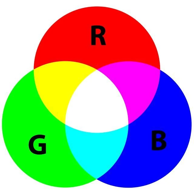
The RGB color model is an additive color model in which the red, green, and blue primary colors of light are added together in various ways to reproduce a broad array of colors. The name of the model comes from the initials of the three additive primary colors— red, green, and blue.
The main purpose of the RGB color model is for the sensing, representation, and display of images in electronic systems, such as televisions and computers, though it has also been used in conventional photography and colored lighting. Before the electronic age, the RGB color model already had a solid theory behind it, based in human perception of colors.
RGB is a device-dependent color model: different devices detect or reproduce a given RGB value differently, since the color elements (such as phosphors or dyes) and their response to the individual red, green, and blue levels vary from manufacturer to manufacturer, or even in the same device over time. Thus an RGB value does not define the same color across devices without some kind of color management.
Typical RGB input devices are color TV and video cameras, image scanners, and digital cameras. Typical RGB output devices are TV sets of various technologies (CRT, LCD, plasma, OLED, quantum dots, etc.), computer and mobile phone displays, video projectors, multicolor LED displays and large screens such as the Jumbotron. Color printers, on the other hand, are not RGB devices, but subtractive color devices typically using the CMYK color model.
Additive colour
Additive color is a color model in which red, green, and blue primary colors of light are added together in various ways to reproduce an array of colors. Three light beams are superimposed, and each can range from fully off to fully on. When light beams are superposed, their emission spectra add up, wavelength for wavelength, to form a new emission spectrum. Zero intensity of all components gives black, full intensity of all gives white. Mixing two primaries at equal intensity forms a secondary color: cyan is green plus blue, magenta is blue plus red, and yellow is red plus green.
CMYK: the subtractive color mixing model
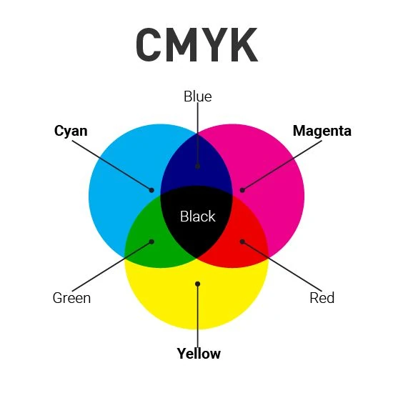
The CMYK color model is a subtractive color model used in color printing as well as describing the printing process. The abbreviation CMYK refers to the four color components used in printing: cyan, magenta, yellow, and black.
In subtractive models, inks reduce the amount of light reflected from a white or light background. White is the color of the substrate, and black results from the combination of inks. This contrasts with additive color models (e.g., RGB color model), where colors are produced by emitting light, white results from combining all primary colors, and black represents the absence of light. The addition of black ink reduces ink consumption and produces more consistent dark tones compared to using cyan, magenta, and yellow alone.
The color wheel
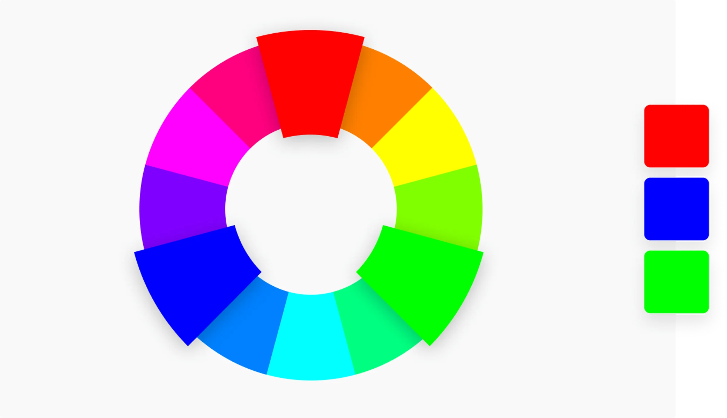
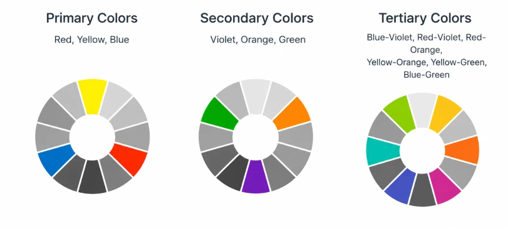
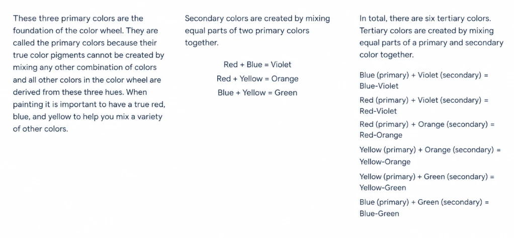
There are two types of color wheel. The RYB or red, yellow, blue color wheel is typically used by artists, as it helps with combining paint colors. Then there is the RGB, or red, green and blue color wheel, which is designed for online use, as it refers to mixing light – like on a computer or TV screen. Canva’s color wheel is an RGB color wheel, as it is designed for online use.
Color wheel basics
Hue, shade, tint and tone
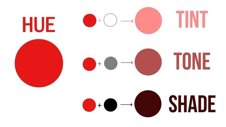
Many people use terms like “hue” and “color” or “tint” and “shade” interchangeably, but the terms have distinctly different meanings. Color is a very general term used to describe every hue, tint, tone, or shade we can see. Hue refers to the dominant color family.
Hue refers to the origin of the colors we can see. Primary and Secondary colors (Yellow, Orange, Red, Violet, Blue, and Green) are considered hues; however, tertiary colors (mixed colors where neither color is dominant) would also be considered hues.
Tint refers to any hue or mixture of pure colors to which white is added. Pastel colors are generally tinted colors. Tinted color remains the same color, but it is paler than the original. When mixing a tint, always begin with white paint and gradually mix in small amounts of color until you’ve achieved the tint you want.
Tone is a hue or mixture of pure colors to which only pure gray is added (equal amounts of black and white). Adding gray to a color will make the intensity much duller. Beware of mixing too much gray into a hue as it can become over-dulled and virtually impossible to restore the brilliance.
Shade is a hue or mixture of pure colors to which only black is added. It contains no white or gray. Shade darkens the color, but the hue remains the same. When mixing a shade, begin with the color itself then add black one drop at a time.
Color Scheme
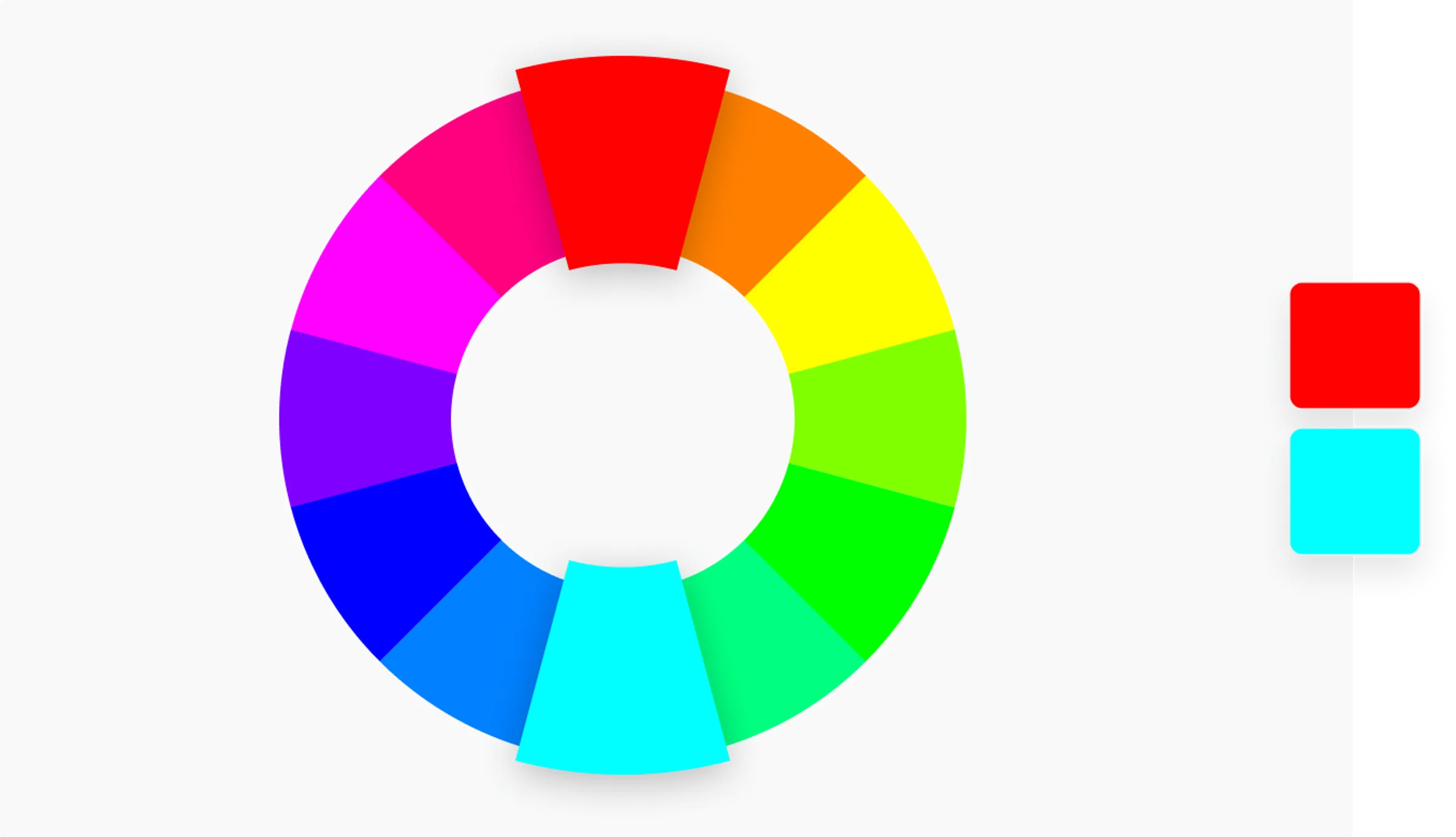
Complementary
Two colors that are on opposite sides of the color wheel. This combination provides a high contrast and high impact color combination – together, these colors will appear brighter and more prominent.
Analogous
Three colors that are side by side on the color wheel. This color combination is versatile, but can be overwhelming. To balance an analogous color scheme, choose one dominant color, and use the others as accents.
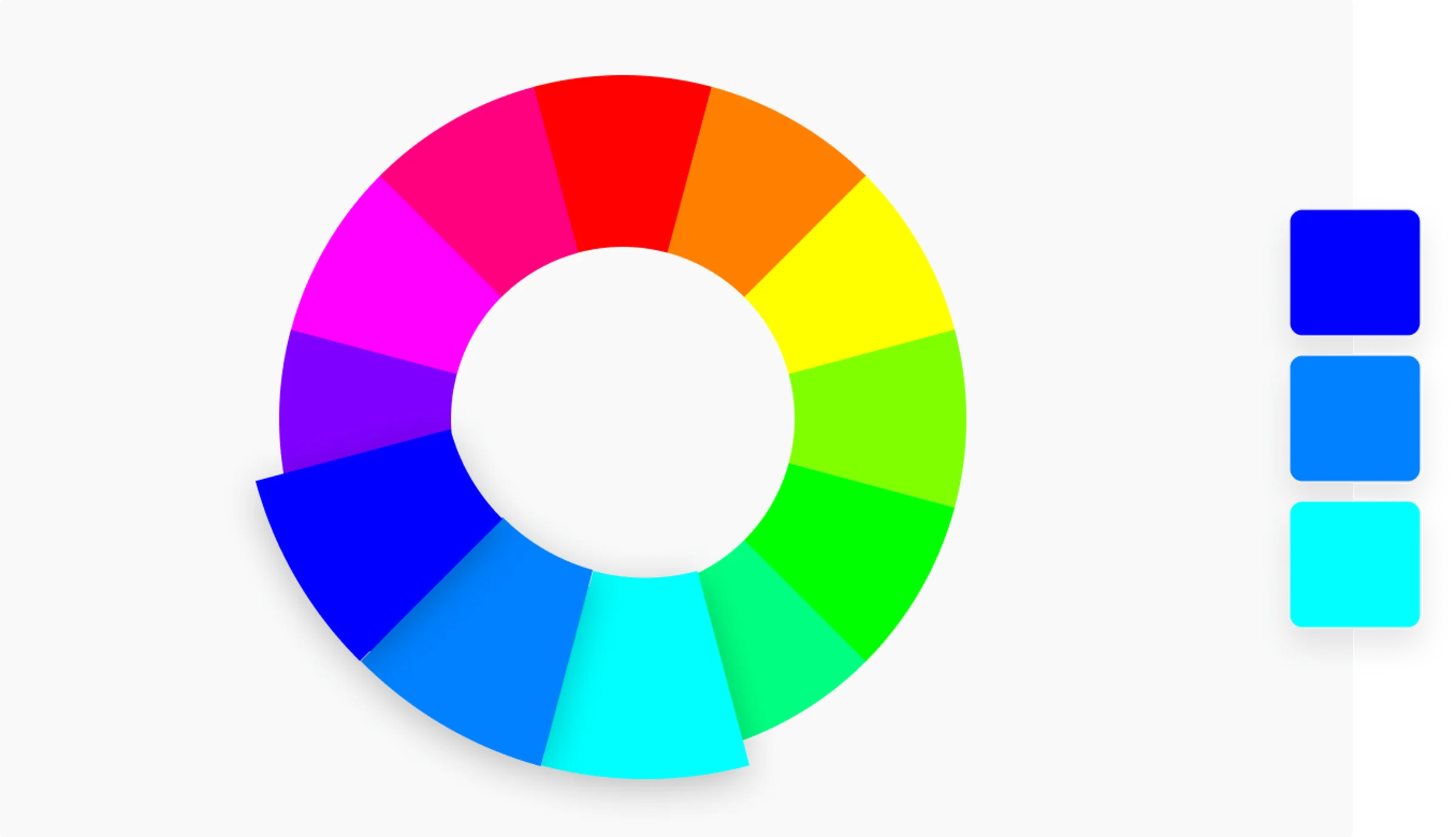
Triadic
Three colors that are evenly spaced on the color wheel. This provides a high contrast color scheme, but less so than the complementary color combination — making it more versatile. This combination creates bold, vibrant color palettes.